How to Choose the Best Colors for Your Website

Think of a website you trust. Now think of one you closed within seconds. Chances are, color played a bigger part in both reactions than you realized. Before a visitor reads a single headline, their brain has already reacted to the color on the screen. It has decided whether the site feels calm or loud, safe or risky, modern or outdated. Research on first impressions suggests people form an opinion about a website in a fraction of a second, and color is a major part of what drives that opinion.
That is why choosing website color is not a decoration task you finish at the end of a project. It is a strategic choice that touches branding, readability, accessibility, and how many visitors turn into customers. A good palette makes your content easier to read and your buttons easier to find. A poor one makes people squint, hesitate, and leave. For businesses, where nearly every industry has dozens of polished competitors, a thoughtful color choice is one of the quickest ways to look credible and stay memorable.
Start With Your Brand, Not Your Favorite Color
The most common mistake in choosing website colors is starting with personal taste. The owner likes teal, so the site becomes teal. That approach feels natural, but it skips the questions that actually matter. Who is your target audience? What do you want them to feel when they land on your page? What does your brand stand for? A color palette should answer those questions visually, not just please the person who approved it.
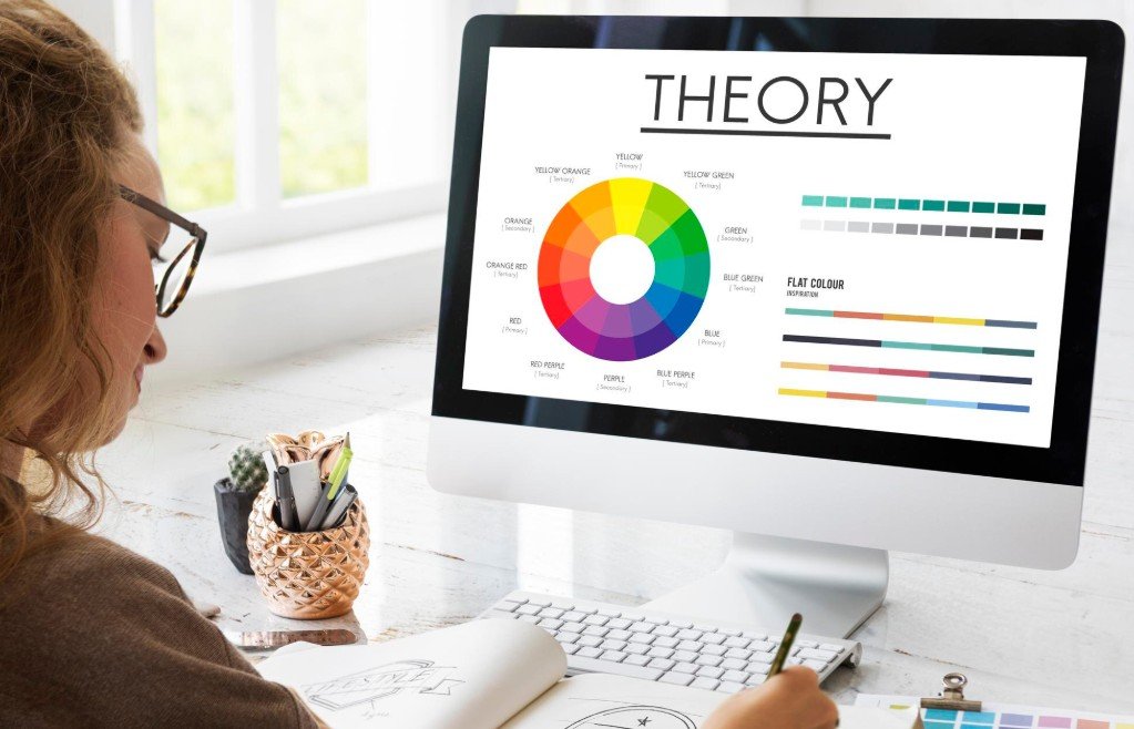
Color psychology gives a useful starting framework, though it works best as a guide rather than a rulebook. Blue is widely associated with trust, stability, and professionalism, which is why banks, healthcare providers, and software companies use it so often. Green connects with growth, health, and calm, making it a common choice for wellness brands and financial services focused on savings. Red signals energy, urgency, and passion, and it tends to appear in food, entertainment, and sales messaging. Orange feels friendly and active. Yellow feels optimistic but can be tiring in large amounts. Purple often signals creativity or luxury. Black and dark tones suggest sophistication, while white and light neutrals suggest simplicity and space.
These associations are not universal. Culture, industry norms, and personal experience all shape how people read color. A color that feels premium in one market may feel cold in another. For a business in the Bay Area serving a diverse audience, it helps to test your palette with real people from your customer base rather than assuming one meaning fits everyone. A short survey or a few informal conversations can reveal reactions that no color chart will predict.
Your existing brand strategy should lead the decision. If you already have a logo, start there. Pull one or two dominant colors from it and build outward so the website feels like a natural extension of everything else your customers see, including packaging, social media graphics, email templates, and printed materials. Consistent color use across channels builds recognition over time. Studies on brand recall have long linked consistent color to stronger memory, which is one reason major brands protect their palettes so carefully. If you are building a brand from scratch, think about the personality you want first. Write down three to five words that describe how you want customers to feel, then choose colors that match those words.
Competitor research is also worth a quick look. Review the websites of the top businesses in your market and note which colors repeat. Some repetition is useful because it shows what your audience expects in your industry. But if every competitor uses the same blue and white, a distinctive accent color can help you stand out without feeling out of place. The goal is to be recognizable, not strange.
Build a Palette That Works in Practice
Once you know the feeling you want to create, the next step is turning it into a working palette. Most effective website palettes follow a simple structure rather than a long list of colors. A common approach is the 60-30-10 rule, borrowed from interior design. About sixty percent of the page uses a dominant neutral or background color, thirty percent uses a secondary color that supports the brand, and ten percent uses an accent color reserved for the elements you most want people to notice, such as buttons and key links.
The dominant color usually forms the background and large content areas. White, off-white, light gray, and very dark tones all work well because they give text room to breathe. The secondary color appears in headers, section backgrounds, icons, and navigation. The accent color is where your strategy shows up. If your main goal is lead generation, the color of your contact button matters more than almost any other design choice on the page. It should stand out clearly from everything around it so a visitor never has to hunt for the next step.

Contrast is the most practical factor in making a palette work. Text must be easy to read against its background, and this is not just a style preference. Light gray text on a white background may look elegant in a design mockup, but it becomes hard to read on a phone in bright sunlight. The Web Content Accessibility Guidelines set minimum contrast ratios, with a ratio of 4.5 to 1 for normal body text and 3 to 1 for large text. Free tools like the WebAIM Contrast Checker let you test any color pair in seconds. A useful habit is to check every text and background combination before the palette is finalized, not after the site is built.
Accessibility deserves more attention than it usually gets. Roughly one in twelve men and one in two hundred women have some form of color vision deficiency, most commonly difficulty telling red from green. If your site uses color alone to communicate meaning, such as red text for errors and green text for success with no other cue, a meaningful share of visitors will miss the message.
Pair color with text labels, icons, or underlines so the meaning survives even when the color does not. Accessible design also supports SEO indirectly, because it improves usability, lowers bounce rates, and reduces legal risk. For any business investing in professional SEO services, an accessible site gives search engines and users a cleaner experience to work with.
Limit the number of colors you use. A palette with one primary color, one secondary color, one accent, and a few neutrals is easier to apply consistently than one with eight competing hues. Too many colors make a page feel chaotic and weaken the visual hierarchy that guides the eye. Restraint usually looks more professional than variety. If you need more range, use lighter and darker shades of your main colors instead of adding new ones entirely. That keeps the page cohesive while still giving your designer flexibility for backgrounds, hover states, and borders.
A practical tip for choosing a starting palette is to use a free tool such as Coolors or Adobe Color. These tools let you generate matching combinations from one base color and preview them on sample layouts. Once you have a promising option, apply it to a real page mockup rather than judging it as a row of swatches. Color behaves very differently on a full page with text, images, and white space than they do side by side in a palette strip.
Test, Measure, and Keep Improving
Even a well-planned palette is a hypothesis until real visitors respond to it. Color choices affect behavior, and that behavior can be measured. This is where web design connects directly to conversion rate optimization. A button color change, a new background shade, or a revised contrast level can shift click rates in ways that are small individually but meaningful over thousands of visits.
A/B testing is the most reliable way to learn what works for your audience. You show half of your visitors one version of a page and half another, then compare results like button clicks, form submissions, or purchases. Tools like Google Optimize alternatives, VWO, and Optimizely make this possible without custom development. The key rule is to test one change at a time. If you change the button color, the headline, and the layout all at once, you will not know which change caused the result.
Be careful with advice that claims one color always converts best. You may have seen articles saying red buttons beat green ones or the reverse. The truth is that no single button color wins everywhere. What tends to matter is contrast against the surrounding page. A bright orange button on a white page may stand out strongly, while the same orange on a warm beige page may blend in. The best button color is the one that is most visible within your own palette, and the only way to confirm it is to test.

Mobile and device testing is another step that is easy to skip. Color appears differently across screens because of brightness, color calibration, and viewing conditions. A subtle gray that looks fine on a high-end monitor may nearly disappear on a lower-quality phone display. Check your site on several devices, including at least one older phone, and view it in both bright and dim lighting. If your site offers a dark mode, test your palette in that mode as well, since colors that work on a white background often need adjustment on a dark one.
Color also plays a role beyond the website itself. The same palette should carry into your social media graphics, email campaigns, and ad creative so your brand feels unified across every place a customer meets it. This consistency supports creative marketing campaigns and makes paid and organic efforts reinforce each other. A visitor who sees a recognizable color scheme in an ad and then lands on a matching page feels continuity, which builds trust and reduces the hesitation that causes drop-offs.
ViewRanking Digital Marketing Agency works with businesses across San Francisco, Palo Alto, and San Jose on design and branding that connects visual choices like color to measurable marketing outcomes, so a palette is judged by how well it supports readability, recognition, and results rather than by taste alone.
Choosing the best colors for your website comes down to a clear process. Start with your brand and your audience. Build a simple palette with strong contrast and a purposeful accent. Check accessibility before launch. Then test, measure, and refine as real data comes in. Color may look like a small detail, but it shapes first impressions, guides attention, and influences whether a visitor takes the next step. Businesses that treat it as a strategic decision, rather than a last-minute style choice, give every other part of their online presence a stronger place to stand.